如何用Bokeh和ggplot制作Grouped and Stacked Column Chart
-
数据有三列:month, agency,3rd party agency 和 drawdown amount
要求横轴是month,纵轴是drawdown amount,每个month画相对应的agency的总drawdown amount。对不同3rd party agency的要求分层。
要求大概是这个样子:
样本数据附上:
Sample.xlsx
-
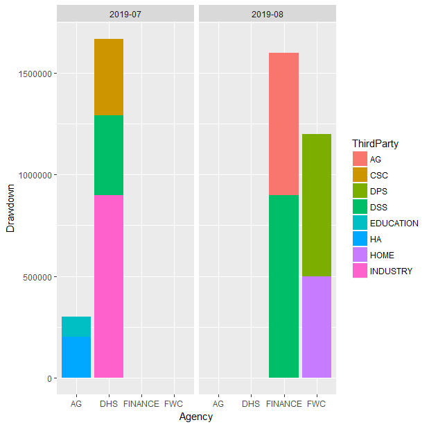
用ggplot解法如下:
data <- clusteredStackBarData %>% as.data.frame

ggplot(data, aes(y = Drawdown, x = Agency, fill = ThirdParty)) + geom_bar(position = "stack", stat = "identity") + facet_grid(~month)
结果如下图
-
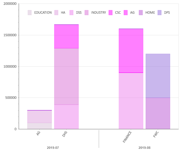
用Bokeh解法借鉴了Bokeh documentation中的Stacked and Grouped Chart
import pandas as pd
import numpy as np
# 讀取數據
df = pd.read_excel("./data/Sample.xlsx")

df.columns = [i.strip() for i in df.columns]

# 讀取所有 x
df_unique = df.loc[:,["Month", "Agency"]].drop_duplicates()


# 把X轉化爲Bokeh可讀的格式
zip_factors = zip(df_unique['Month'].tolist(), df_unique['Agency'].tolist())
factors = list(zip_factors)

# 讀取所有可能的 3rd Party Agency
agencies = df['3rd Party Agency'].unique().tolist()

# Set colors
# 這裏要注意,如果agency的數目太多的話,可能會出現color不夠用的情況。這種情況下可以進入這個網址
# https://docs.bokeh.org/en/latest/docs/reference/colors.html?highlight=color#bokeh-colors-groups
# 找Bokeh的顔色包
num_agencies = len(agencies)
from bokeh.colors.groups import purple
colors = [purple[i+1] for i in np.arange(num_agencies).tolist()]

dict_source_data = dict(x = factors)

# 整理數據格式
for ag in agencies:
    temp = df.loc[df["3rd Party Agency"] == ag, :]
    temp1 = df_unique.merge(temp, how = "left",left_on = ["Month", "Agency"], right_on = ["Month", "Agency"] )
    dict_source_data[ag] = temp1.Drawdown.fillna(0).tolist()

# Bokeh 作圖

from bokeh.io import output_file, show
from bokeh.models import ColumnDataSource, FactorRange
from bokeh.plotting import figure
from bokeh.colors.groups import purple

# 這裏可以調整Bokeh的theme 可以選的有
# caliber
# light_minimal
# dark_minimal
from bokeh.themes import built_in_themes
from bokeh.io import curdoc
# caliber
# light_minimal
# dark_minimal
curdoc().theme = 'caliber'

#print(purple[1:2])
output_file("bar_stacked_grouped.html")

source = ColumnDataSource(data=dict_source_data)

p = figure(x_range=FactorRange(*factors), plot_height=500,
           toolbar_location=None, tools="")

p.vbar_stack(agencies, x='x', width=0.9, alpha=0.5,color = colors
             , source=source,
             legend_label=agencies)

# 不用科學計數法顯示y軸
from bokeh.models import BasicTickFormatter
p.yaxis.formatter = BasicTickFormatter(use_scientific=False)

p.y_range.start = 0
p.y_range.end = 2000000
p.x_range.range_padding = 0.1
p.xaxis.major_label_orientation = 1
p.xgrid.grid_line_color = None
p.legend.location = "top_center"
p.legend.orientation = "horizontal"

#show(p)


#p = Bar(df, label='date', values='count', stack='class',  group='user',
#    )

#output_file("bar.html")

show(p)
-
Bokeh的效果图: