究竟哪个领域的精算师工作时间最长?用R Shiny App统计精算师工作时长的调查结果
-
前段时间用问卷星做了调查,大概收到了40份反馈。现在让我们来看看可视化结果吧!
https://mengke-lyu.shinyapps.io/WorkingHoursStatisticsActuary/
这个网站是我用Shiny App做到云端的图表。
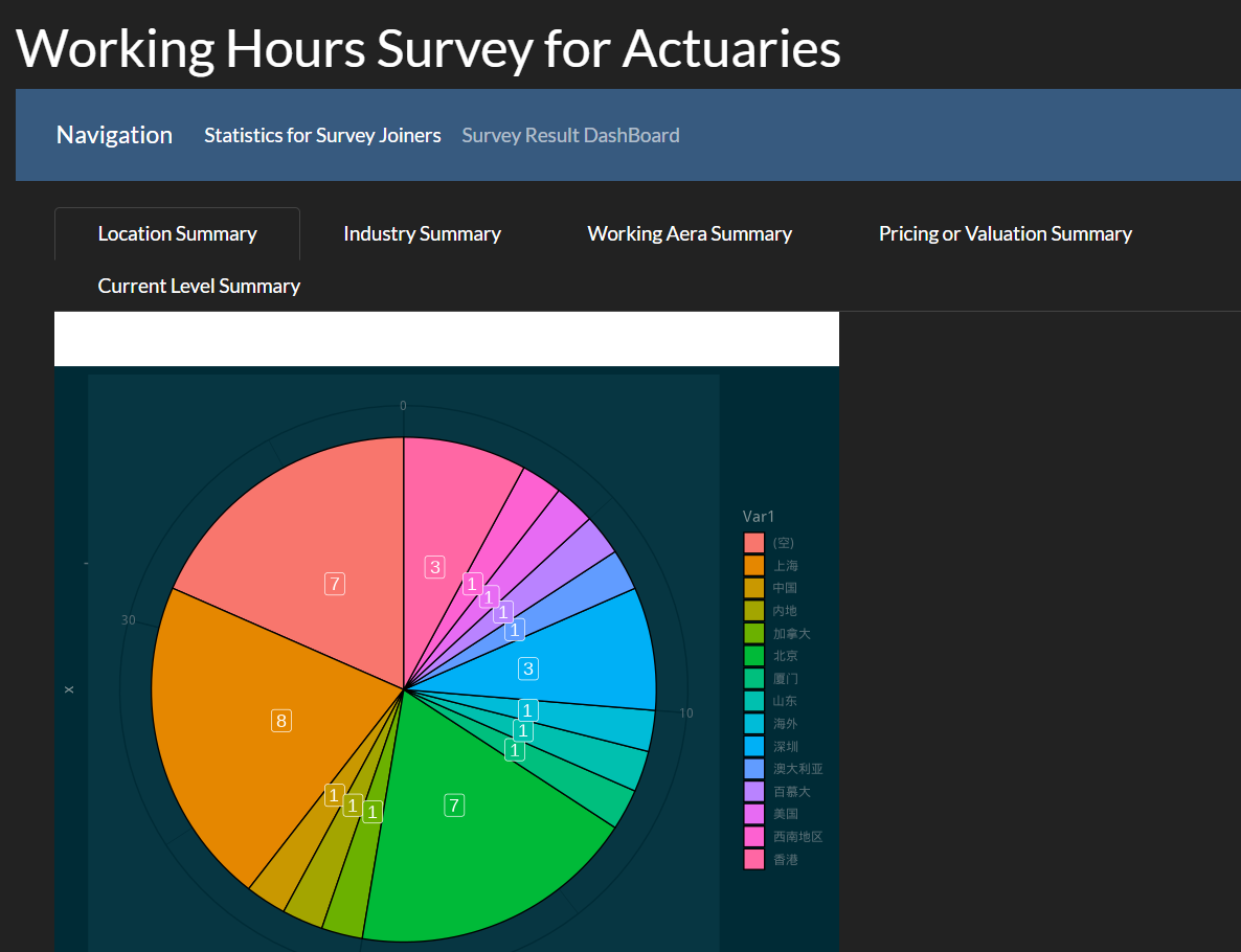
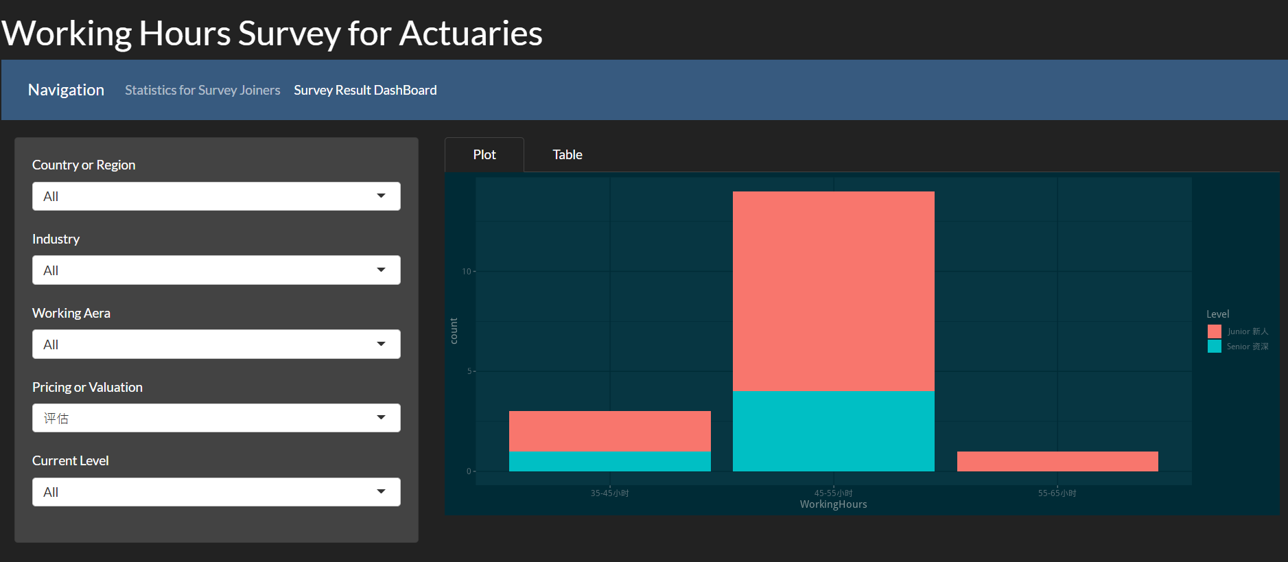
Navigation这里有两个分支,一个是可以看参与者的背景分布,另一个是看不同领域的参与者的工作时长分布。究竟哪个分支工作时间最长呢?建议通过网站来得到答案哈哈
-
代码:
library(tidyverse)
library(readxl)
tsActuary = read_excel("time statistics.xlsx")

backupName = names(tsActuary)

names(tsActuary) = c('No',"Time","Duration","Source","Details","IP","Location","Area","WorkingArea","Area2","Level","WorkingHours")


library(shiny)
library(bslib)
library(ggplot2)
library(ggthemes)
library(showtext)

# counts
hisplot = ggplot(data.frame(tsActuary), aes(x=WorkingHours)) +
  geom_bar()

hisplot <- renderPlot({
  ggplot(data.frame(tsActuary), aes(x=WorkingHours)) +
    geom_bar()
})

ui <- fluidPage(
  theme = bs_theme(version = 4, bootswatch = "dark"),
  titlePanel("Working Hours Survey for Actuaries"),
  navbarPage(
    "Navigation",
    tabPanel("Statistics for Survey Joiners",
             mainPanel( tabsetPanel(type = "tabs",
                                    tabPanel("Location Summary", plotOutput("Locationsummary",width = "600px", height = "600px")),
                                    tabPanel("Industry Summary", plotOutput("Industrysummary",width = "600px", height = "600px")),
                                    tabPanel("Working Aera Summary", plotOutput("WorkingAreasummary",width = "600px", height = "600px")),
                                    tabPanel("Pricing or Valuation Summary", plotOutput("PorVsummary",width = "600px", height = "600px")),
                                    tabPanel("Current Level Summary", plotOutput("CLsummary",width = "600px", height = "600px"))
             ))),
    tabPanel("Survey Result DashBoard",
             sidebarLayout(
               sidebarPanel(selectInput("countryInput", "Country or Region",
                                        choices = c("All", unique(tsActuary\$Location))),
                            selectInput("AreaInput", "Industry",
                                        choices = c("All", unique(tsActuary\$Area))),
                            selectInput("WorkingAreaInput", "Working Aera",
                                        choices = c("All", unique(tsActuary\$WorkingArea))),
                            selectInput("Area2Input", "Pricing or Valuation",
                                        choices = c("All", unique(tsActuary\$Area2))),
                            selectInput("LevelInput", "Current Level",
                                        choices = c("All", unique(tsActuary\$Level)))),
               mainPanel( tabsetPanel(type = "tabs",
                                      tabPanel("Plot", plotOutput("hisplot")),
                                      #tabPanel("Summary", verbatimTextOutput("summary")),
                                      tabPanel("Table", tableOutput("results")))
               ))
  )
  )
)


server <- function(input, output) {
  #bs_themer()
  filtered <- reactive({
    filtered = tsActuary
    if(input\$countryInput != "All")(
      filtered <-
        filtered %>%
        filter(
          Location == input\$countryInput
        )
    )
    if(input\$AreaInput != "All")(
      filtered <-
        filtered %>%
        filter(
          Area == input\$AreaInput
        )
    )
    if(input\$AreaInput != "All")(
      filtered <-
        filtered %>%
        filter(
          Area == input\$AreaInput
        )
    )
    if(input\$WorkingAreaInput != "All")(
      filtered <-
        filtered %>%
        filter(
          WorkingArea == input\$WorkingAreaInput
        )
    )
    if(input\$Area2Input != "All")(
      filtered <-
        filtered %>%
        filter(
          Area2 == input\$Area2Input
        )
    )
    if(input\$LevelInput != "All")(
      filtered <-
        filtered %>%
        filter(
          Level == input\$LevelInput
        )
    )
    filtered
  })
  output\$hisplot <- renderPlot({
    showtext.begin()
    g = ggplot(data.frame(filtered()), aes(x=WorkingHours,fill=Level)) +
      geom_bar()+ theme_solarized_2(light = FALSE,base_family ="wqy-microhei") +
      scale_colour_solarized("blue")
    print(g)
    showtext.end()
  })
  output\$results <- renderTable({
    table(filtered()\$WorkingHours)
  })
  output\$Locationsummary <- renderPlot({
    showtext.begin()
    g = ggplot(
      data.frame(table(tsActuary\$Location)),aes(x="",y=Freq,fill=Var1)) +
      geom_bar(stat='identity',color="black")+
      geom_label(aes(label = Freq),color = "white",size=5,
                position = position_stack(vjust = 0.5),show.legend = FALSE)+
      coord_polar(theta="y") +
       theme_solarized_2(light = FALSE,base_family ="wqy-microhei") +
      scale_colour_solarized("blue")
    print(g)
    showtext.end()
  })
  output\$Industrysummary <- renderPlot({
    showtext.begin()
    g = ggplot(
      data.frame(table(tsActuary\$Area)),aes(x="",y=Freq,fill=Var1)) +
      geom_bar(stat='identity',color="black")+
      geom_label(aes(label = Freq),color = "white",size=5,
                 position = position_stack(vjust = 0.5),show.legend = FALSE)+ coord_polar(theta="y") +
      theme_solarized_2(light = FALSE,base_family ="wqy-microhei") +
      scale_colour_solarized("blue")
    print(g)
    showtext.end()
  })
  output\$WorkingAreasummary <- renderPlot({
    showtext.begin()
    g = ggplot(
      data.frame(table(tsActuary\$WorkingArea)),aes(x="",y=Freq,fill=Var1)) +
      geom_bar(stat='identity',color="black")+
      geom_label(aes(label = Freq),color = "white",size=5,
                 position = position_stack(vjust = 0.5),show.legend = FALSE)+ coord_polar(theta="y") +
      theme_solarized_2(light = FALSE,base_family ="wqy-microhei") +
      scale_colour_solarized("blue")
    print(g)
    showtext.end()
  })
  output\$PorVsummary <- renderPlot({
    showtext.begin()
    g = ggplot(
      data.frame(table(tsActuary\$Area2)),aes(x="",y=Freq,fill=Var1)) +
      geom_bar(stat='identity',color="black")+
      geom_label(aes(label = Freq),color = "white",size=5,
                 position = position_stack(vjust = 0.5),show.legend = FALSE)+ coord_polar(theta="y") +
      theme_solarized_2(light = FALSE,base_family ="wqy-microhei") +
      scale_colour_solarized("blue")
    print(g)
    showtext.end()
  })
  output\$CLsummary <- renderPlot({
    showtext.begin()
    g = ggplot(
      data.frame(table(tsActuary\$Level)),aes(x="",y=Freq,fill=Var1)) +
      geom_bar(stat='identity',color="black")+
      geom_label(aes(label = Freq),color = "white",size=5,
                 position = position_stack(vjust = 0.5),show.legend = FALSE)+ coord_polar(theta="y") +
      theme_solarized_2(light = FALSE,base_family ="wqy-microhei") +
      scale_colour_solarized("blue")
    print(g)
    showtext.end()
  })
}

shinyApp(ui = ui, server = server)
-
这里总结下几个知识点,遇到的问题以及解决的过程。
设计思路是首先有一个大数据框,然后根据用户的选择来筛选出小数据框并把结果图展示在网页上。技巧一:reactive
因为每次筛选都要同时改变数据图和数据表,所以用了reactive来避免重复写代码。
Reactive内部的内容会在每次改变筛选条件的时候更新。Reactive里面写的内容就是筛选出想要的数据框的过程。这个最终数据框会被用到图和表里面。问题一:字体问题
我把这个App发布到云端的时候,发现ggplot里面的中文变成了乱码,猜测原因是云端没有ggplot默认的中文字体。所以就用了showtext这个包来改变ggplot的字体。之后就可以成功运行了。