一行代码EDA:Python和R中可以用一行代码进行数据探索性分析的包介绍和对比
-
最近在公众号中常常看到关于Pandas-profiling和Sweetviz的推文。今天又看了一篇Pandas-profiling,Sweetviz 和Autoviz之间的比较,便一发不可收拾,打算自己找左右相关包做一个对比。
Python:
- Pandas-profiling
- Sweetviz (最近的心头好)
- 主要优势是可以用来比较两个Data Frame
- 既可以用来看干净数据,也可以用来看一些脏数据,但是最好把pairwise_analysis的选项选为off,避免出错的可能。
- Autoviz
R
https://nextjournal.com/eda/automated-eda
- dataMaid
- 可以用于处理数据前看简单的Summary。
- autoEDA
- 用于干净数据。
- ExPanDaR
- 用于干净数据。创建一个R shiny app.
- DataExplorer
- 推荐博文
- 镶嵌ggplot可以进行简单使用
-
我第一个探索的包是ExPanDaR。结果非常惊艳,唯一的缺点是依赖包较多,安装比较麻烦。
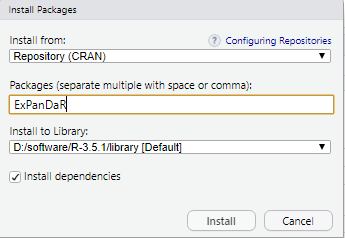
这个包在安装的时候报了这个错:cannot open the connection。仔细一看,是安装依赖包(dependencies)的时候出现的问题。没有办法,只能手动安装啦。
在这个包的CRAN网址下载好之后,从本地进行了安装
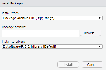
安装好了以后,运行的时候会报没有依赖包的bug,只要观察没有的依赖包是哪个,一个一个安装好就行。过程比较麻烦,但是有效。如果大家发现别的好方法,可以留言鸭。
-
带大家探索一个这个包内置的数据框:World Bank
library(ExPanDaR)

ExPanD(df = worldbank,
       df_def = worldbank_data_def,
       var_def = worldbank_var_def,
       df_name = "World Bank Data",
       title = "WORLD BANK DATA EXPLORATION",
       abstract = paste("今天珂珂就带领大家",
                        "探索ExPanDaR这个包",
                        "略略略"),
       export_nb_option = TRUE)
生成效果展示:
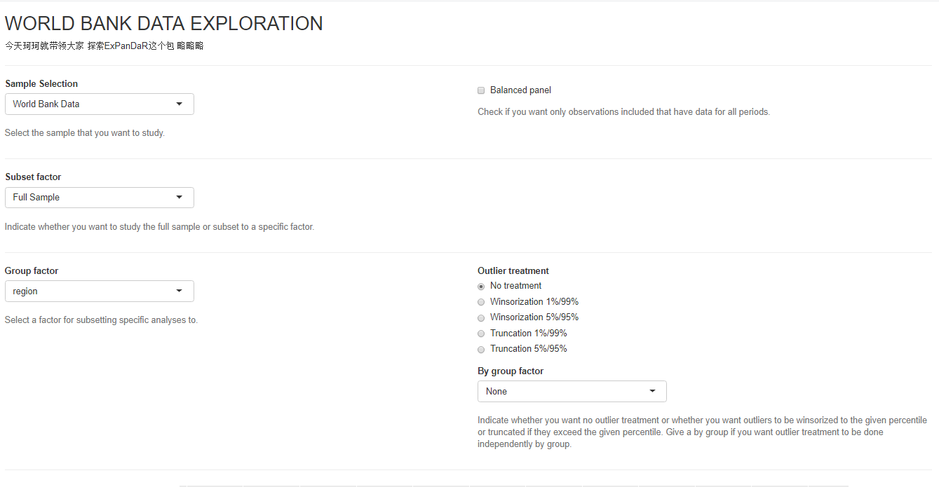
首先一个功能是是否要展示全部的数据,还是选择一个子集。Group factor之后会被用于在下面的图中进行选择。(之后进行细讲)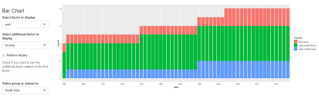
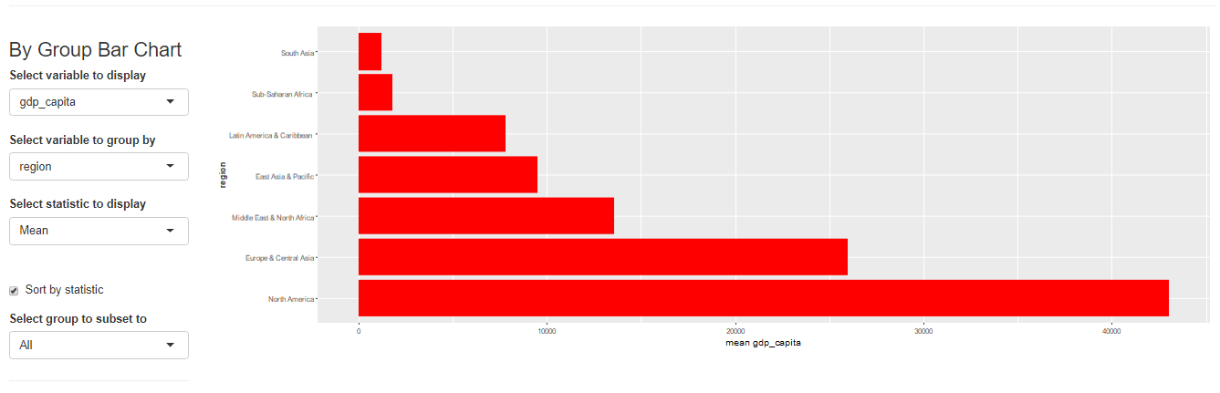
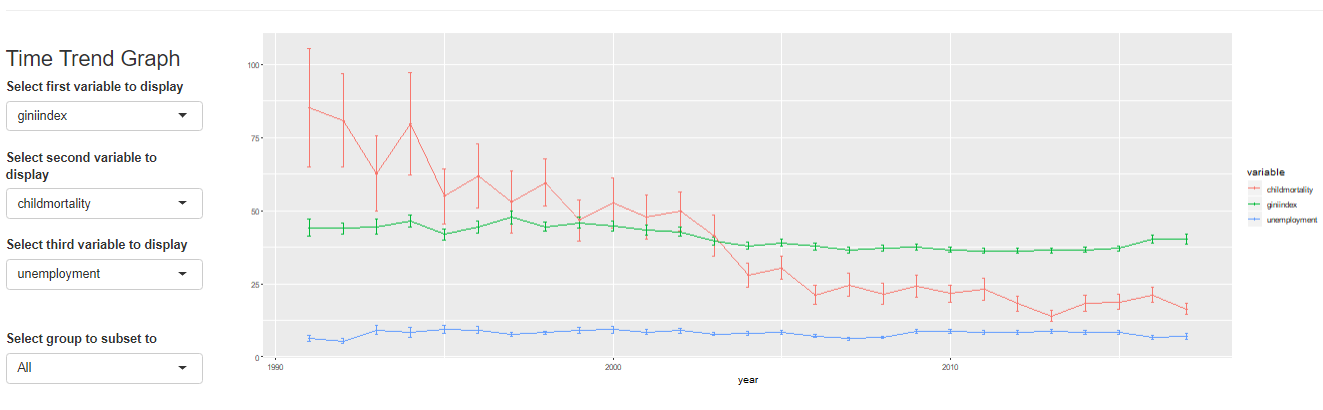
第一个是条形图,可以在侧边选择x和y。Select to group to subset to这个栏目里面可以选择上面说的Group变量。比如说Group选择了region的话,这里就可以选亚洲,这个条形图就会根据亚洲的数据绘制。
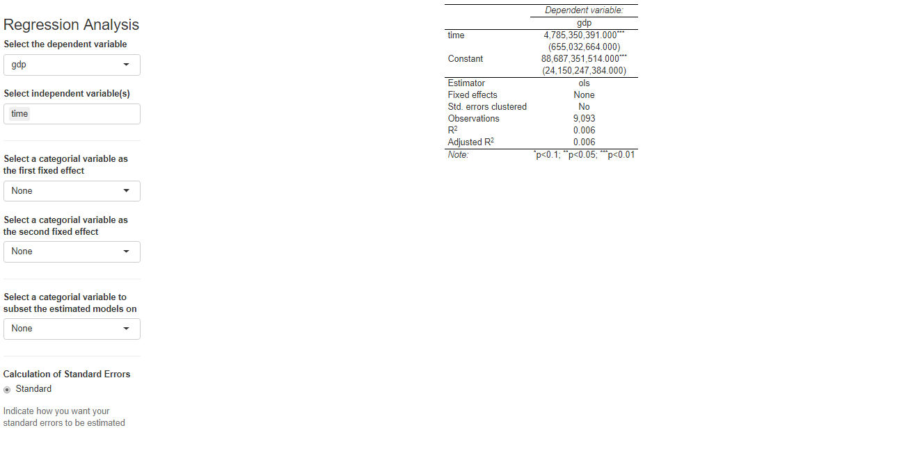
最后居然还有做简单回归的功能!
这个网页app一共有哪些部分呢?
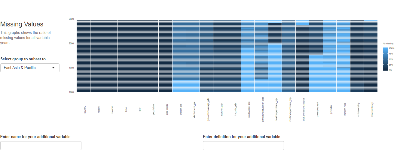
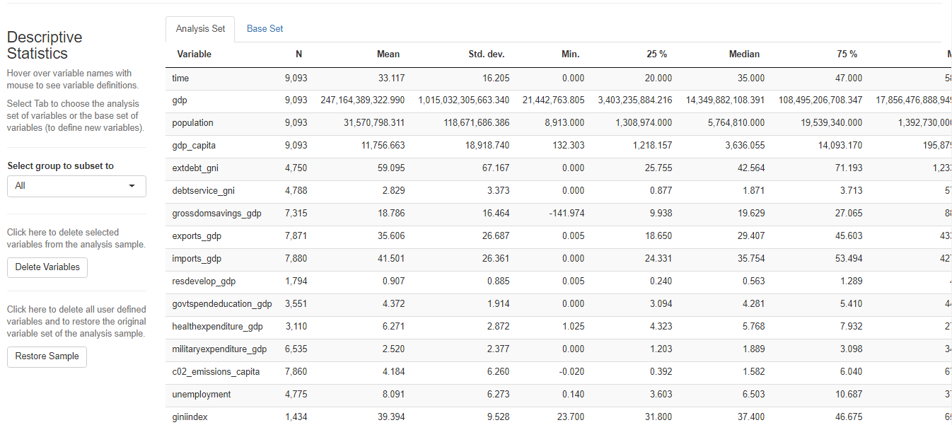
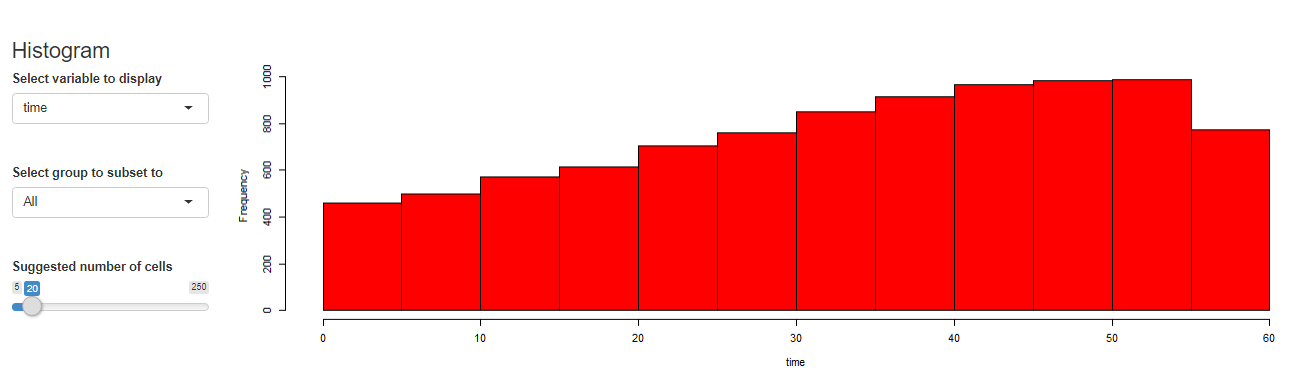
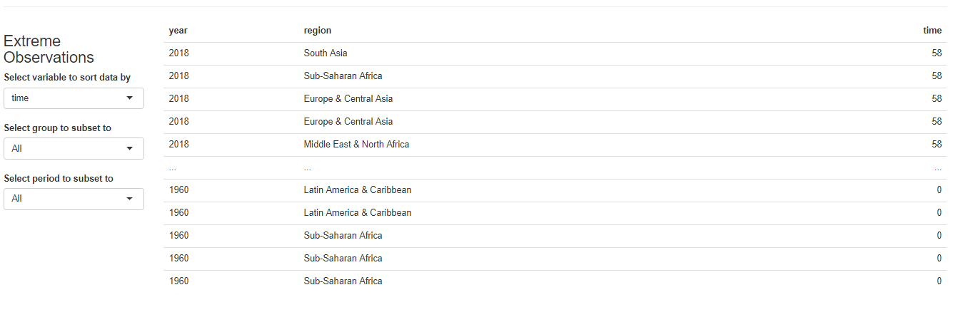
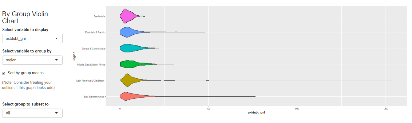
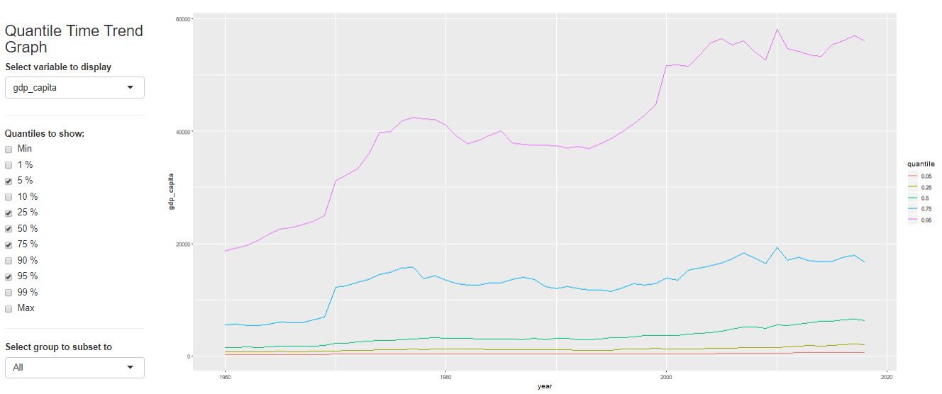
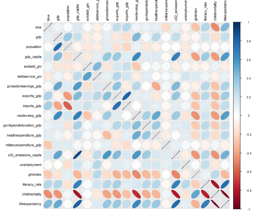
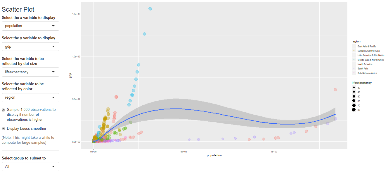
Name Description sample_selection A drop down menu to select the sample to be used and whether it should be balanced subset_factor A drop down menu to select a factor on which to limit the sample and an additional menu to select the value of that factor on which you want to focus the analysis grouping A drop down menu that gives you the option to name a grouping factor. The grouping factor allows the user to focus certain components on a sub-sample defined by a value of that factor. Also, the grouping component contains the dialog four outlier treatments bar_chart A component displaying a bar chart reporting the observations by time period missing_values A visual displaying the frequency of missing values for each variable and time period udvars A component that allows users to define additional variables (see below) descriptive_table A descriptive table for all numerical and logical variables contained in the sample histogram A histogram to display the distribution of a chosen numerical or logical variable ext_obs A list displaying the 5 most extreme observations for a chosen variable, overall or by time period by_group_bar_graph A bar graph that visualizes a chosen descriptive statistic by a chosen grouping factor by_group_violin_graph A by group violin plot, where users can choose the variable and the grouping factor trend_graph A graph that visualizes the development of up to three variables over time quantile_trend_graph A graph that visualizes the distribution of one chosen variable over time corrplot A visual representation of Spearman and Pearson correlations of the numerical and logical variables in the sample. Exact correlations are displayed when you hover above the respective cell with your mouse scatter_plot A scatter plot, where you can present up to 4 dimensions of your data (x, y, size, color). You can choose whether you want a LOESS line to be displayed and whether you want your sample to be limited to 1,000 observations regression A regression component where you can estimate a linear or logit regression, with up to two fixed effect levels and standard error clustering 如果想展示其中的一部分,可以用components这个参数来控制哪些部分要进行显示
library(ExPanDaR)

ExPanD(df = worldbank,
       df_def = worldbank_data_def,
       var_def = worldbank_var_def,
       df_name = "World Bank Data",
       title = "WORLD BANK DATA EXPLORATION",
       abstract = paste("今天珂珂就带领大家",
                        "探索ExPanDaR这个包",
                        "略略略"),
      components = c(descriptive_table = TRUE,
                             by_group_violin_graph = TRUE,
                             scatter_plot = TRUE,
                             regression = TRUE)  ,
      export_nb_option = TRUE)
这个app好是好看,但是需要的数据处理也非常多。比如说如果我想对国家做分组,那么一定要把国家这个变量处理为factor格式,需要做的预处理非常多。
-
探索的第二个包是DataMaid,这个包名字非常可爱。数据女仆。
可爱归可爱,这个包的安装使用没有那么简单。首先是要安装这个包本身,其次要保证你的电脑装了Tex或者TinyTex,这样的话可以直接生成PDF的数据报告。
library(dataMaid)
makeDataReport(worldbank, replace = TRUE)
我第一次运行的时候报了错:
The log file hopefully contains the information to get MiKTeX going again:
C:\Users\ASUS\AppData\Local\MiKTeX\2.9\miktex\log\pdflatex.log
Error: LaTeX failed to compile dataMaid_worldbank.tex. See https://yihui.org/tinytex/r/#debugging for debugging tips. See dataMaid_worldbank.log for more info.
怎么办呢?我就直接按照说明,打开了log文件。发现报错说我的MikTex没有检查过更新。好叭,于是我就打开了MikTex console,更新了所有包。继续跑一样的代码,还是报错= =。又打开log文件,看到错误是GUI framework cannot be initialized. 好叭,打开万能的互联网,互联网说需要设置安装包的方式
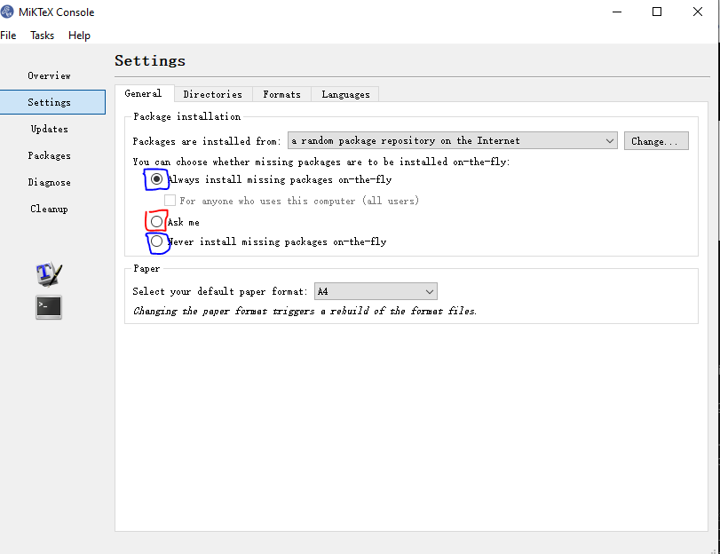
这里不能选择Ask me,而是要选择蓝色框框的两个之一。选好之后再跑,哇哦,可以啦!
自动跳出了一个PDF文件,看起来非常高端大气!
-
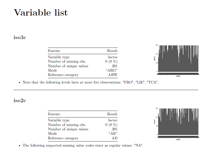
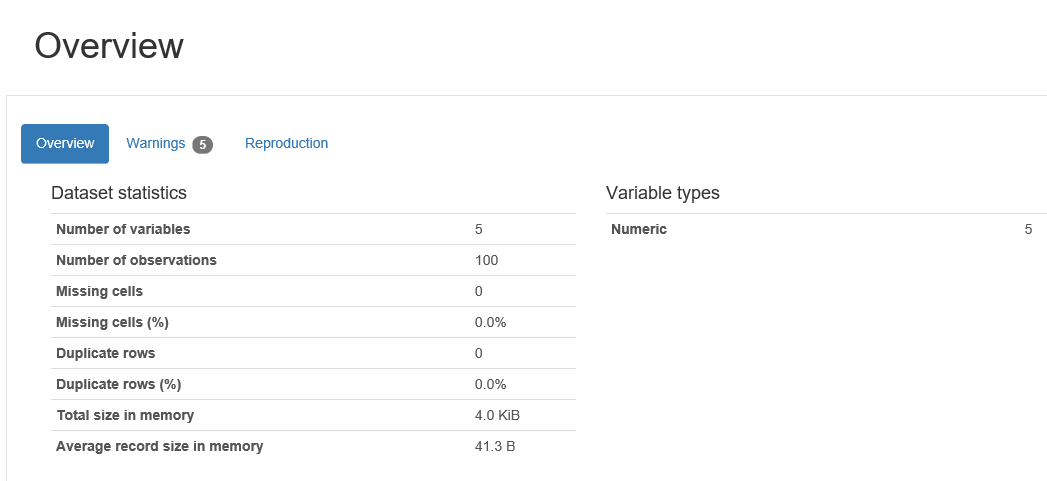
第一个部分是一个Overview,告诉你这个数据集有几行几列,小女仆对每个变量根据数据类型做了哪些检查。
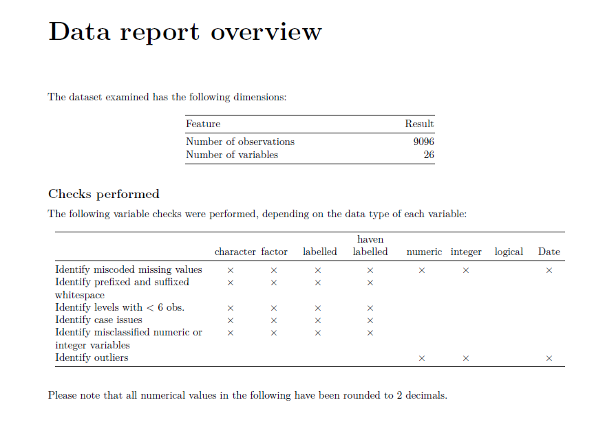
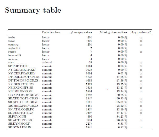
可以看到有一些非常好的检查,比如”Identify prefixed and suffixed“就是检查数据有没有前空格和后空格。有前后空格,比如” 吃饭“和”吃饭 “都是不好的数据形式。接下来的一个部分是一个Summary Table,里面会检查各种变量类型,有多少可能的值以及缺失值。Any Problem那里是指是否在Overview里面的检查中被检查出了问题。有问题的话就会出现一个 $ \times $的符号。
最后一个部分是对每个变量的单独分析,会列出变量类型众数等等, 其中reference category指的是所有category按照字符串排序的第一个。频率分布图会出现在右面,不过当横坐标x太多的时候可能看起来不太清楚。
表格和频率分布图的下方是根据之前的检查发现的问题。
关于DataMaid还有一篇论文也不错
总结:DataMaid非常适合用于在对数据一无所知的情况下进行简单的数据研究,可以检查数据中可能的问题,避免在未来出错。
-
-
下一个包是
Pandas-Profiling
安装过程:首先创建了虚拟环境pandas-pro,然后安装了pandas-profilling这个包
python -m venv pandas-pro
pandas-pro\Scripts\activate.ps1
pip install -U pandas-profiling[notebook]
安装完成后运行代码
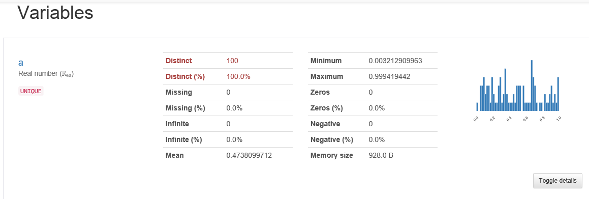
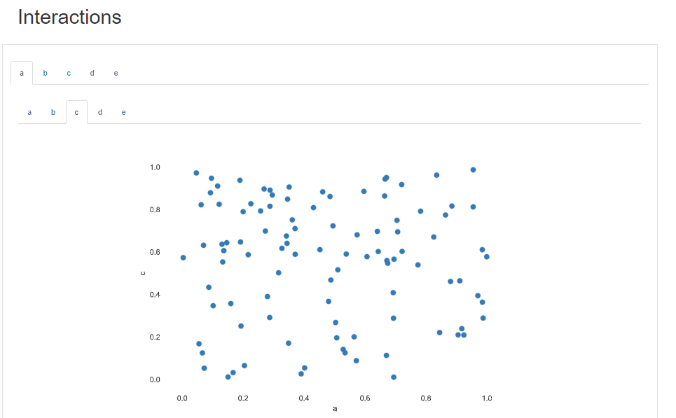
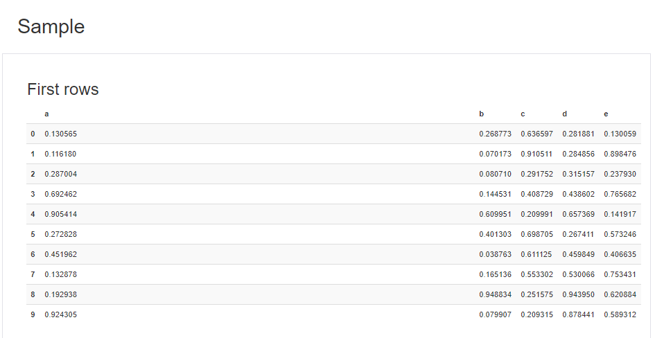
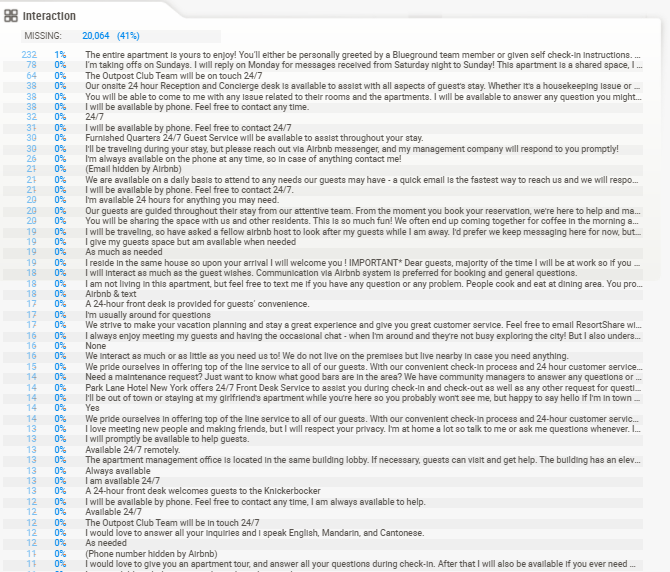
import numpy as np
import pandas as pd
from pandas_profiling import ProfileReport
# 模拟数据集
df = pd.DataFrame(np.random.rand(100, 5), columns=["a", "b", "c", "d", "e"])
profile = ProfileReport(df, title="Pandas Profiling Report")
# 输出html文件格式的report
profile.to_file("report.html")
打开生成的html文件,整个report由几个部分组成:
- Overview
- Variables
- Interactions
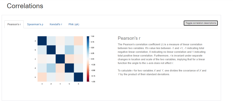
- Correlations
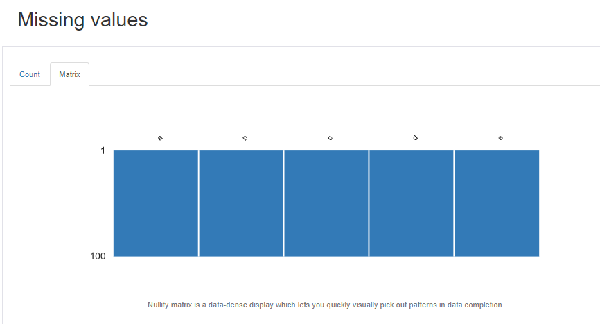
- Missing values
- Sample
可以直接点击导航栏到对应位置

-
Sweetviz
Sweetviz是我最喜欢的包之一,因为使用起来简约,且信息量丰富,且外观好看。它的一个独特的功能是数据集比较。
Sweetviz的使用和安装和上一个pandas-profiling很像python -m venv sn-ven sn-ven\Scripts\activate.ps1 pip install sweetviz下面的例子中我用了Airbnb的数据
import pandas as pd
df = pd.read_csv('./data/listings.csv',header=[0])
# importing sweetviz
import sweetviz as sv
#analyzing the dataset
advert_report = sv.analyze(df )#, pairwise_analysis="off"
#display the report
advert_report.show_html('details_data.html')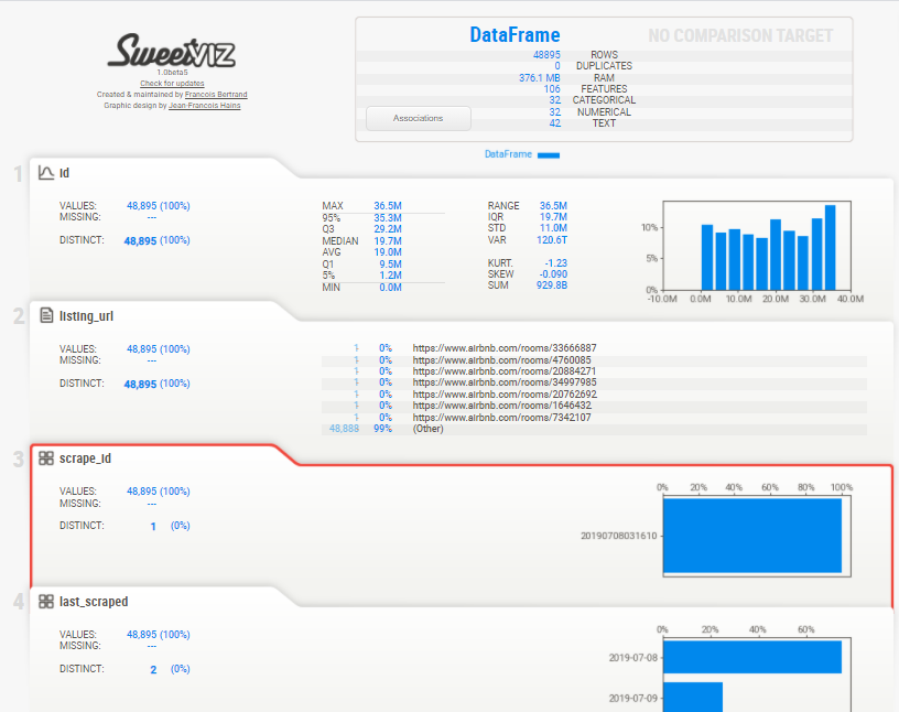
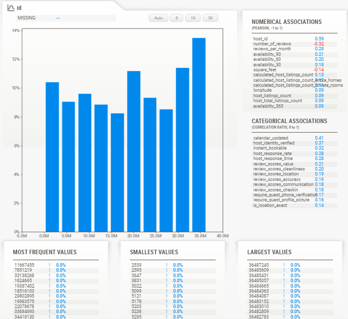
点击任意一个数值型变量后,会出现关于它的详细统计量,比如说最频繁出现的,最大值,最小值等等
-
AutoViz
照例,先安装
python -m venv au-ven
au-ven\Scripts\activate.ps1
pip install autoviz
然后报了错,首先是第一个错是
ModuleNotFoundError: No module named 'scipy.special.cython_special'上网查了一下,原来是scipy版本不兼容,于是乎把scipy降到了1.4.1版本
python -m pip install scipy==1.4.1
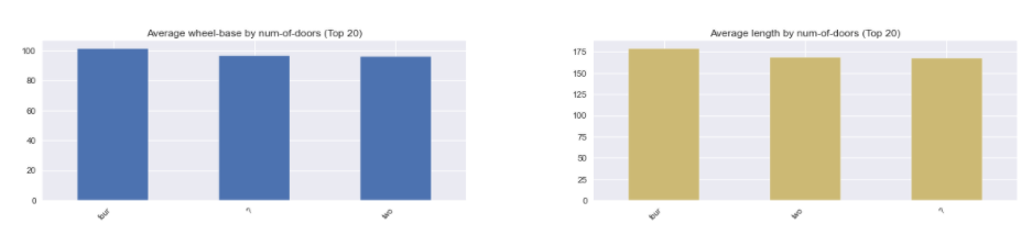
之后发现,原来必须要用jupyter来跑这个包,因为它无法像Sweetiviz等包生成html版本的report。from autoviz.AutoViz_Class import AutoViz_Class # 数据集来源:https://github.com/hmix13/AutoViz AV = AutoViz_Class() df = AV.AutoViz('car_design.csv')Jupyter Lab -> There you go!
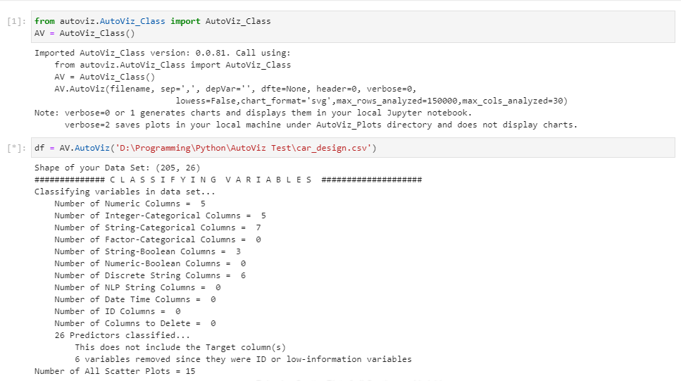
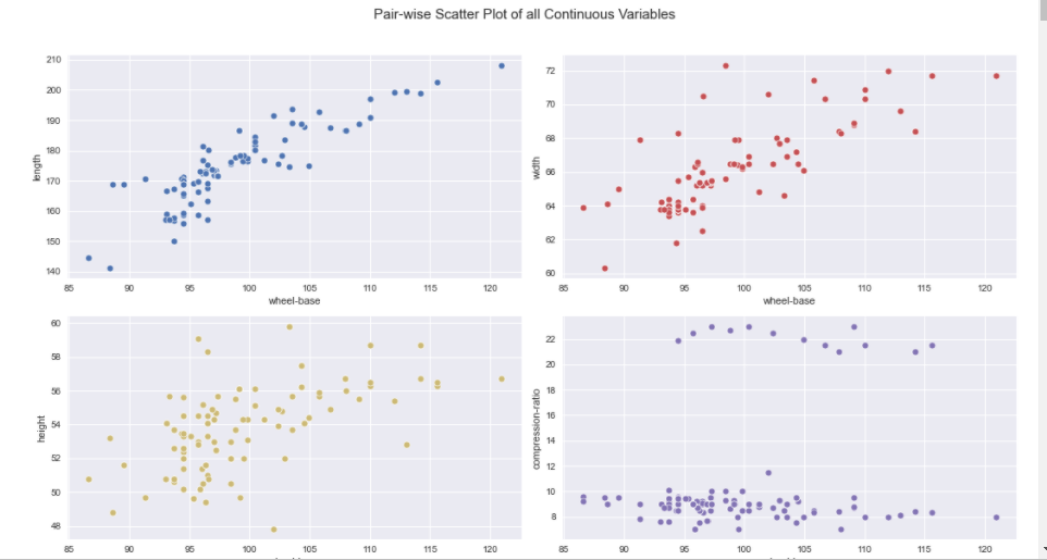
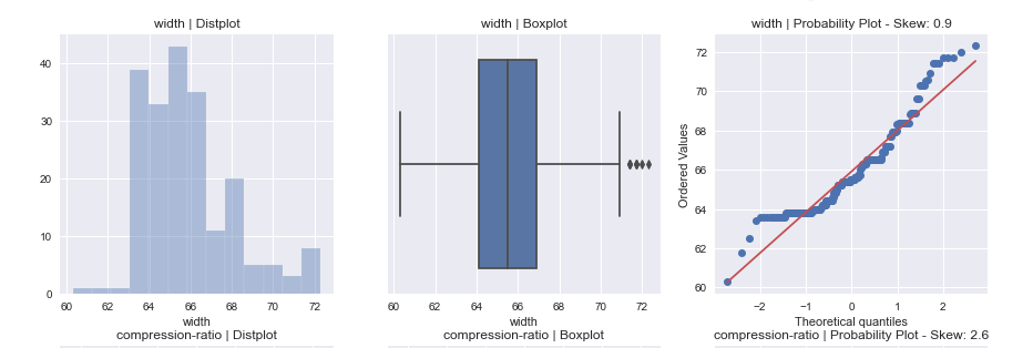
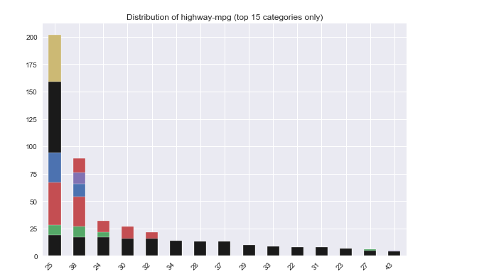
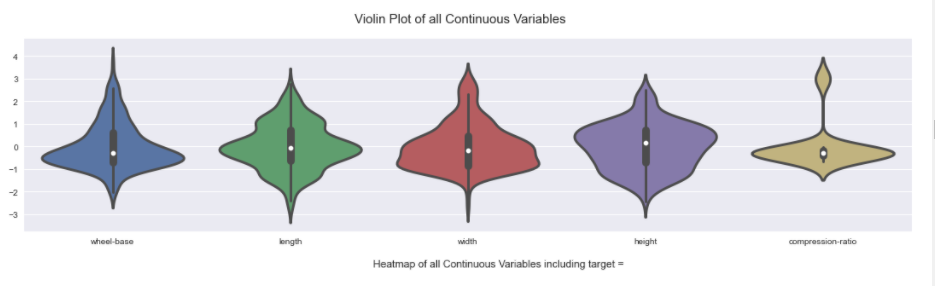
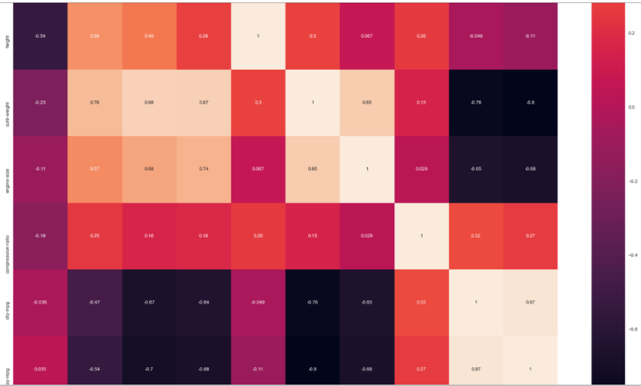
说实话,没想到这个包震惊到了我,它的图实在太好康了